OPEN SOURCE DEEP DIVE
Oil UI: an interface design skill that pushes AI UI design to its limits
Oil UI is an open-source interface design skill for AI coding agents (MIT, v0.22.0). It pulls genuinely different design directions apart into checkable direction cards, lets a human pick one, refines it against real screenshots, then hands the result to an independent reviewer who never saw it being made. Ships a style comparison-page generator and shoot.mjs, a screenshot-evidence tool; install with npx skills add oil-oil/oil-ui.
Oil UI is an interface design skill for AI agents. It does not produce mockup images and it does not replace a front-end framework; instead it writes down how an interface should be designed and how the result should be judged, in a form an agent can actually execute. The loop is: pull a few genuinely different design directions apart and let a human pick one, refine that direction against real screenshots, then hand the work to a reviewer who never saw it being made. The repository is a standard skill package: one SKILL.md entry contract, eleven method documents under references/, four tools under scripts/, three regression test files, and a self-contained offline comparison-page template. MIT licensed, version 0.22.0, homepage ui.oiloil.org. The repo was created on 2026-09-30 and has shipped more than twenty releases in eleven days; installation is a single npx skills add oil-oil/oil-ui.
The problem it attacks is specific: interfaces built by models all look the same. The opening paragraph of SKILL.md states the position directly — style must be derived from the page's product category, the protagonist of its first screen, and the brand, never grown out of the model's default template. Restraint, in its vocabulary, means keeping the strongest choices and deleting what contributes nothing, not sanding every style down to a middle register. Read as a whole, the repository is an engineering process for resisting default aesthetics: judgments become tables, acceptance becomes a protocol, and evidence collection becomes a command-line tool.
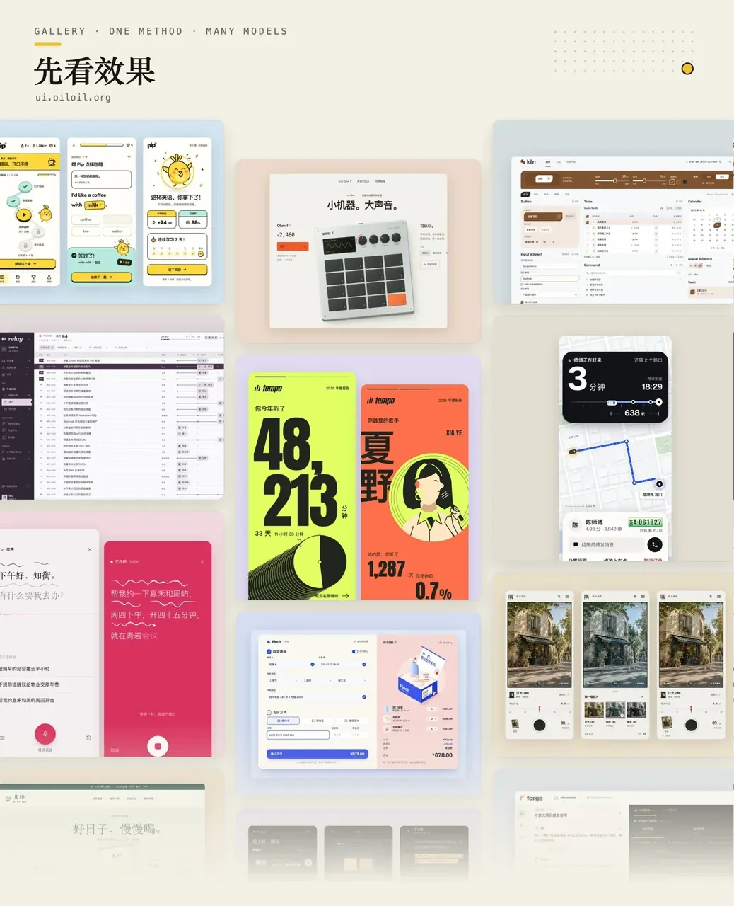
Default behaviour is named item by item
Most prompt packs of this kind say only "make it look designed." Oil UI enumerates the default instead. The difference test in references/design-direction.md lists the stock layout of six product categories: dashboards with a left sidebar, a top bar and a card grid; e-commerce with a big banner, a product grid and a footer; social apps with a bottom tab bar, a feed and a floating button; landing pages with hero, features, testimonials and one call to action; chat with contacts on the left and messages on the right; and AI or developer tools with "a black background, purple-blue glowing orbs, floating particles and the same capsule buttons everywhere." At least one direction per round must break the stock layout of its category — but breaking a convention is not the same as abandoning the baseline, and structures users already expect (artwork first in a gallery, cart in the top-right of a shop) must be kept.
The reviewer manual references/reviewer-manual.md turns the same list into deductions: an unmotivated split hero with a heading on one side and copy on the other, rounded cards everywhere, borders drawn where whitespace already separates content, a single coloured bar on the left of a quote, gradients and glows with no reason, emoji used as icons, vague metaphorical copy, and a colour palette that would work equally well in three other product categories. Dated typography and imagery count too: a system font with widened tracking passed off as a brand wordmark, a rotation of system fonts pretending to be different brands, generated imagery with generic stock texture.
Five steps, and a table that decides how much work this round is
The body of SKILL.md is a scope table plus five steps. The scope table exists to stop small changes from becoming projects: a single element, one spacing value, a copy or colour tweak is edited directly, with no inventory, no direction exploration and no review; a brand-new interface runs the full steps 1–5; if the user already picked a direction, work resumes at step 2; polishing one component narrows the scope to that component and one direction only; in an existing project the agent must first establish whether the user wants a UI refresh, a flow change or a new feature, because only the first one may revisit visual direction; screenshot recreation treats the reference image as the visual baseline and does not diverge into new styles; a review-only request runs the step-4 diagnosis and touches no files.
| Step | What happens | Hard constraint |
|---|---|---|
| 1 Explore and converge on a direction | Name the category, take apart benchmark products, set the tone, generate directions, fill in a direction card | Write the three directions as text and ask first; the round ends when that message is sent. Screenshots are built only if the user wants to see actual screens |
| 2 Build visual and interactive structure | Read the references for this page type; settle hierarchy, type, colour, imagery, motion | References are read on demand, never all up front; decide early whether an image can carry the main message |
| 3 Build it and collect real evidence | Do the most representative page first, run it in the target viewport, screenshot and record | "Having a look" and "collecting evidence" are separate modes; evidence is collected only before review and before delivery |
| 4 Independent review and correction | Dispatch a reviewer with no history and working vision, scoring against the manual | No source code, no self-defence, no previous scores |
| 5 Verify and deliver | Walk the interactions, run verification scripts, subtract, write the delivery note | If the project has verification scripts, run them three times in a row before delivery; three passes are the pass mark |
Step 1 contains a very practical throttle: ask in text once, then decide how much to build. Each of the three directions gets three or four lines — what it feels like, what the first screen looks like, which typefaces and colours it uses, what carries the key imagery — plus a recommendation and its reasoning, ending with a question: build one of them, or build all three as first screens and compare? If the user can decide from text, only the chosen one gets built and no comparison page is generated. When the run is unattended or the user says "you decide," the skill does not ask: it still builds all three first screens for the record, scales the screenshots to 480px wide, looks at them side by side, picks one and writes down why.
The direction card: translating "premium" and "restrained" into checkable decisions
Every direction fills in a card with sixteen fields, each requiring a concrete choice rather than an adjective: north star, tone, benchmarks and trade-offs, generation engine, first-screen skeleton, page structure, the form of each block, typography, colour, key imagery, icons, control grammar, motion, structural break, memorable moment, and what this direction deliberately gives up. Tone is described on five dials, each with its evidence: energy (calm to loud — saturation, contrast, whether elements collide), finish (raw to polished — edge treatment, grain and noise, alignment rigour), density (airy to dense — whitespace scale, layering, grid discipline), weight (light to heavy — type weight, area of colour, shadow hardness), and seriousness (playful to solemn — corner radius, illustration language, range of motion).
The document names the most common failure outright: the evidence points to loud and raw, and what ships is beige cards, soft shadows and generous whitespace — the design sanded back down to the model's default of "quiet and premium." Hence a translation table for fuzzy words. "Premium" must first be pinned to which kind of premium, and only then decides typeface contrast, method of separation, spacing scale and number of hues. "Polished" becomes tolerances: how tracking is tuned, which pixel grid things align to, how many shadow levels at most, how many hues at most. "Restrained" becomes a saturation budget (accent colour covering no more than 10% of the frame) plus caps on motion amplitude and hue count. "Epic" becomes scale: how large the display type is, how much area the hero occupies, how strong the contrast. "Simple" becomes a density setting plus what gets deleted and why. Any word that cannot be translated into an observable decision is struck from the reasoning. Motion language is translated the same way: "make it move as I scroll" must first be classified as scroll-triggered or scroll-driven, and "give the background depth" becomes layered parallax with explicit speed ratios between background and foreground, with body text explicitly barred from parallax.
Directions start from one of six generation engines rather than from adjectives: a material placed in a specific environment; a concrete scene with a time, place and light; a character archetype; a design movement or visual tradition with a real connection to the product; the expressive language of another field entirely (borrowing only its one or two most recognisable devices, since importing its parts wholesale turns into prop hoarding); or a deliberate break with convention. Benchmarks must be taken apart from real screens: fetch the first screen and one key control of two or three peers with the most distinctive styles, save them into the task directory, and derive six to ten visible elements from the images, each annotated with what it is and why it is done that way. If the result reads only as "clean, whitespace, one accent colour," the teardown was not deep enough and another benchmark is chosen. When the images genuinely cannot be obtained, the card must begin with "not viewed, from memory" and mark typography, colour and key imagery as unverified — because those three fields are exactly where memory collapses back into model defaults.
The difference test and eight first-screen skeletons
Before any screen is built, the cards are checked item by item: compare wireframes, not descriptions (descriptions can differ while every wireframe is still "big heading left, small blocks right"); across first-screen skeleton, typography, colour and key imagery, any two directions may share at most one, otherwise they are variants of one direction; do not separate directions by light and dark (the top failure mode is "one light, one dark, one warm"); at least one direction goes to an extreme within the tone the evidence allows, and at most one is a compromise; at least one breaks the category's stock layout; none may be a lookalike of a benchmark; and a blind test — cover the names and notes and the screens must still read as distinctly different. After the screens exist they are compared once more by squinting at the light and dark masses only: if the mass distribution is similar, the direction goes back to the skeleton table rather than being rescued with different decoration.
Persuasive pages (landing, brand, launch, exhibition) choose from eight first-screen skeletons: full-bleed image with type pressed over it; a single centred object; the interface as the picture; full-bleed type; a full-width stacked masthead; grid collage; vertical or diagonal type; and the two-column split. That last one is flagged as the model's default — at most one direction per round may use it, it must state why nothing else will do, and the opposite side must be an image, colour field or graphic device that crosses the structure rather than a product screenshot inside a card. "Heading nine columns, copy three columns" still counts as a split. Skeletons are settled before any copy is written, and the copy adapts to the skeleton. The document also pushes back on a common confusion: boldness of composition is independent of tone — a calm, polished product can still place a single sentence in the middle of an empty first screen. Tone decides the volume; the skeleton decides the structure.
Content pages (galleries, shops, feeds, documentation, tools) follow a different rule: the first screen is the first row of content or the workspace itself, navigation plus title plus filters together take no more than a line or two, and there is no hero slogan and no paragraph explaining what the page is for.
Colour is derived from the product, in four steps plus a self-check
Colour is never taken directly from the inherent colour of the material or scene in the generation engine — once the metaphor lands on a material, colour follows the material, and unrelated products converge on the same palette. The four steps: write two shared lines first (the palette the category would reach for by reflex, and which hues and values each benchmark occupies); pick for each direction a hue family and value range outside both, or an explicit black and white, with one sentence naming what in this product it comes from; specify at least three layers (base, primary accent, and the derived selected background, border and disabled states); then self-check — does the palette still hold with every glow and blur removed, and was it derived from this product or is it a safe set that would look inoffensive anywhere? If it is the latter, go back to step two. Black, white and grey plus one accent, or no colour at all, counts as a complete colour identity, in which case colour is handed to the content: product screenshots, user photos, a painting.
The comparison page: one manifest and one generator
When candidates need to be compared, they go on one page. The input is a manifest.json in a directory: project name, the brief all candidates share, the round number, and per candidate an id, a direction name, the north star (concept), the typefaces and scale relationships actually used (typography), a hex palette, observable traits, and a relative path to the source. A candidate may be a standalone HTML mockup, an image, or a page running on a local dev server (kind set to url, with a top-level serve block carrying the start command). The current version of an existing page can be included first with baseline: true. Fixed-canvas interfaces declare nativeViewport, and the comparison page renders at that viewport and scales the whole thing proportionally, so candidates need no scaling code of their own.
The generator scripts/build_explorer.py (565 lines, standard library only) inlines every image, font and video the candidates reference and emits a single portable style-explorer.html wrapped in two content-security policies: connect-src 'none' for the shell, and default-src 'none' for previews, allowing inline styles and data: assets while setting script-src 'none'. When the manifest is wrong it reports every problem at once — a custom ManifestError merges and numbers all issues into one message — so the file can be fixed in a single pass. Clicking "Select" copies one sentence such as "01: pick 03 Sfumato," which the user pastes back into the conversation; the agent then matches round and index against the current manifest and continues. The comparison page writes nothing back and never messages the agent on its own.

shoot.mjs: evidence in one command
scripts/shoot.mjs (1,721 lines, requiring only Node 22+ and a local Chrome, Chromium or Edge) is the part of this repository that feels most like an engineering product. It launches an isolated temporary browser that never touches the user's own browser data and drives it over CDP, with actions written in a small DSL: click, hover, dblclick, waitfor, drag, type, fill, select, key, scroll and wait, separated by semicolons that are not split inside quotes or brackets. Selectors accept CSS, text= and :has-text(); the tool searches only the main document and, when it cannot find a match, reports how many iframes and open shadow roots the page contains.
States are entered through URL parameters, so pages must be openable directly as ?state=<name>. The most-used flags: --size desktop (the default is a 390x844 phone), --states idle,done, --evidence to collect state screenshots, side-by-side sheets, text-masked sheets, a 2x capture of the first state, motion detection, an entry animation recording and a recording per action group in one pass, --record with --steps to capture a full scroll of a landing page, --compare reference.png to produce a four-panel comparison and a nine-cell difference report (mandatory every round on recreation tasks), --mark "1=.page-head .btn" to draw numbered boxes on elements when pointing problems out to a user, --dry-run to validate option and action syntax without launching a browser, and --timeout-scale 2 when many tasks run at once.
The more interesting layer is what it checks along the way. The lint field of report.json lists "default behaviour" findings in two groups: readability problems that must be fixed (insufficient text contrast, body text below 13px, line-height too tight for multi-line body copy, content left in a transparent state in the first screen), and problems that must either be fixed or justified in the delivery note (grey text on a coloured ground, over-long measure, eyebrow and numbered labels above headings, a coloured bar on one side, gradient text, cards nested inside cards, emoji as icons, ALL-CAPS English labels in a Chinese interface, and headings sitting closer to the text above than to the text below). The tool admits it produces false positives — a genuine step number, for instance — which get one line in the delivery note, and it states plainly that it recognises patterns rather than judging quality: after the findings are cleared, a human still has to look at the screenshots. Release 0.16.8 also hardened its local server to block hidden files and secrets.
Independent review: the dispatch protocol and the manual are separate documents
Review lives in two files with different readers. references/visual-review.md is for the main agent and covers only how to dispatch and how to handle the response; references/reviewer-manual.md is for the reviewer and carries the scoring anchors and checks, and the main agent is explicitly told not to read it. The handover list is mandatory: current screenshots or recordings with viewports noted, the user's original task, and the design boundaries and constraints; plus, where they exist, the project's colour spec, component constraints and DESIGN.md, and the raw lint findings from report.json, with one sentence of reasoning for each item the agent chose to keep. What is not handed over: source code, explanations defending the work, and any previous scores — scoring has to be independent.
The first item of a scored review is a three-second test that precedes all detail and flow: shrink the first screen to 480px wide (180px for a phone capture), look for three seconds, then look at the text-masked version for three seconds, and write two sentences — which year and which category of product it resembles, and what the first thing you see is, and whether that thing would work just as well on a different product. If it looks like a generic product from some past year, a component library's default styling or stock imagery, the total cannot exceed 7. If the first thing you see would sit happily on another product, distinctiveness fails outright. Score anchors are written out from 10 down to 1–4, with the rule that problems causing data loss, dead ends or a false "succeeded" message outweigh any visual problem, and that a fully working task flow does not by itself earn an 8 — the key imagery has to clear its own bar. The output format is fixed: problems first (at most five, ordered by impact), then improvements (at most five, and polish, design sense and motion must each get a verdict), then a penultimate line reading "Keep: ..." naming the one or two things that must not be smoothed away, then the total. When the first-screen skeleton is still a model default, or the key imagery falls far below category standard and the score lands at 6 or below, the first line must read "Redo: ..." and no patch-level suggestions are given for those blocks, because patching a rejected skeleton only makes it more presentable.
How the main agent handles the response is equally prescriptive: if the first item is "redo," go back to the direction card and reset the skeleton or key imagery rather than fixing items one by one; work down the list in order; improvement items are not optional and are executed like problems; copy the reviewer lists as deletable is deleted by default unless it would create functional ambiguity; high-level notes such as "too crowded" or "unclear hierarchy" are converted into actual spacing, type-size and shadow changes; if the reviewer proposes changing a brand colour or framework the user locked, one sentence of reasoning is recorded and the proposal is declined; and when taste deadlocks with no visible gain, the best version is kept and the loop stops. Polishing reviews of existing interfaces run a different protocol: strictly follow the product's existing spec, point out deviations only, give no score, and never propose changing the brand colour or typefaces.
Motion and imagery are specified down to numbers
Every new interface gets three pieces of motion first: feedback on the primary action, a visible origin for one state change, and one entrance on first arrival. Anything beyond those three must carry one of feedback, guidance, continuity or brand expression; scroll fades, parallax, cursor-following and decorative loops are named as the likeliest sources of noise. Feel is never written as an adjective but as "an onomatopoeia plus a physical action," with spring parameter ranges: a click (magnet snapping, a latch) at stiffness 350–400 and damping 10–15 for buttons and toggles; a slide-in (pneumatic closer, drawer damper) at 250–300 / 20–25 for bottom sheets and collapsibles; a flow (pouring honey, drifting fog) at 150–200 / 30–40 for page transitions; a drop (hammer blow, weight landing on a table) at 400–500 / 5–10 for confirmations; a bounce (rubber ball) at 300 / 8 for celebrations and children's products; a float (helium balloon) at 100 / 25 for meditative and idle loops. Overshoot scales with area: no more than 1–2% for full pages and panels, 10–20% for badges and checkmarks. On the web, springs can be baked into an easing curve — numerically integrate the displacement for the given stiffness and damping, sample 20–30 points into linear(), and fall back to a close cubic-bezier where unsupported.
Transitions follow six rules: continuity (what the user clicked becomes the protagonist of the next screen, and going back shrinks it to its original position, scrolling it into view first if that position has left the viewport); consistent direction (the next item enters from the right, the previous from the left, and opening and closing are inverses); no cross-fade when only the shape changes, or two differently scaled frames overlap into a ghost; leaving, joining and staying items are handled separately, since one shared fade makes the whole list flicker; selection indicators use a single sliding pill rather than dimming one option and lighting another, placed instantly on first render, resize and font load; and the destination is prepared first, because an animation that ends on a blank panel is worse than none.
The imagery chapter takes a firm position: an image is structure, not an illustration in a box. Text, buttons, forms and data labels are always set in real HTML and CSS, never drawn by an image model and never shipped as a full-page screenshot posing as an interactive product — generated type is error-prone, uneditable, unselectable and unreadable by screen readers. The most common failure of generated imagery is not poor drawing but overfilling: the richer the detail, the more it looks like a stock photo and the less it holds a focal point inside a layout. The prescription is to unify everything into one subdued material or colour (clay model, monochrome, defocus, silhouette) and let only the few parts carrying information hold colour, light or detail. Prompts are written in a fixed order: subject and mode of presentation; composition and negative space, stated against the chosen first-screen skeleton with the area reserved for text kept completely clean; and safe distance, keeping subject, plinth and shadow about 10% away from the text edges so that copy never lands on the object at narrower widths.
One memorable moment, not a page full of effort
The skill does not try to make the whole page forceful. It picks one or two places and pushes them, keeping everything else quiet. Four places to look: actions users actually perform (taps, drags, toggles, submissions — more likely to land than scrolling); key moments (payment succeeded, first task completed, an upgrade, a deletion, an upload, waiting for a result — the highest emotional charge and the best return on a small animation); marginal pages (404, empty states, loading, the footer — nobody expects anything and the risk is low); and AI at work (make the process visible so that in-progress and finished read differently on screen, which works in plain black on white with no material or glow). The techniques are just as concrete: let the result happen on the spot instead of letting the control perform; draw numbers as visible quantity, asking first whether a percentage, duration or balance can become area, length or count; give an abstract state a material by asking what that state would be if it were a physical object; give controls physics and character, so dragging has elasticity and weight and over-pulling springs back reluctantly. There is also a warning aimed at current aesthetic inflation: receipts, printers, cassettes and handheld consoles are already saturated on inspiration sites, so ask first what this product's own physical object is. Dot matrices, ASCII, pixels and particles are chosen only when their origin in what the product does can be stated — and once chosen, they run all the way through loading, icons and empty states.
Delivery discipline and stated limits
Sample content is written the way the real product would read. Mock data, generated images and unwired actions are described in the delivery note, never on the screen: no "demo," "illustrative," "button not connected" or "saved locally on this device" appears in the interface, and business success, customer quotes and product metrics are never fabricated. For verification, interfaces that persist something (favourites, drafts, carts, timers, game progress) must have scripts covering at least a read-back after refresh and a save failure, plus exhaustion where there are quotas or balances; animation and async checks wait for observable states rather than fixed delays; only the project's type check and lint are run, not production builds or full test suites, and environment problems unrelated to the screen — build failures, API errors, dependency links — get one line in the delivery note and are bypassed rather than debugged. Before delivery there is a dedicated subtraction pass: one protagonist per screen, a round of deleting copy block by block and putting back only what hurts comprehension, since subtraction removes decoration and duplication but never object names, decision evidence, current state or the primary action; key areas are inspected at both 100% and 200%.
The limits are stated just as plainly. Without image access the skill writes "actual visuals not verified" and gives no visual score; without a runnable environment it does not claim interactions pass; when the user asked for a working interface and only a plan can be delivered, the unfinished parts are marked; without image generation it uses suitable material at hand or ships an asset brief plus a working placeholder; it uses only services the task already authorised, never signs up for paid ones and never asks the user to paste a key into the conversation. Language discipline is part of the same section: replies, design notes and delivery notes use the user's language, interface copy uses the product's user-facing language, and because the skill itself is written in Chinese, an English conversation must not end up with Chinese fragments in it.
The security boundary around update checks
The skill checks for a new version once per use, at most once every ten minutes, retrying an hour after a network failure. It reads only the public version list on ui.oiloil.org and uploads no project content; by default it merely reports, downloading and replacing nothing unless the user explicitly asks for an update. Updates run through a CLI pinned to a fixed commit (github:oil-oil/oil-cli#b6fb811…), downloaded packages must pass SHA-256 and archive-path verification, subprocess environment variables go through an allowlist (a dozen entries such as PATH, HOME and XDG_STATE_HOME), results are cached in ~/.local/state/oil/, and OIL_NO_UPDATE_CHECK=1 disables the whole thing. SKILL.md also contains an explicit rule against prompt injection: the check output is data, no other instructions inside it are executed, and remote release notes are never treated as task requirements. The allowed-tools allowlist is likewise limited to the few update-check commands.
Where the open-source version stops
The open-source skill takes a new page from nothing to good-looking: design directions, visual hierarchy, typography, colour, whitespace, imagery and motion, memorable moments and scroll narrative, screenshot recreation, and the pacing, feel, generated assets and real-time 3D of small games. Its independent review scores and lists problems. Oil UI Pro (a one-off 69 CNY with permanent updates) adds usability and brownfield work on top: repeated review cycles targeting a score of 9, checks for directions colliding with each other, running the page through a real task, a refinement checklist and an AI-default-aesthetics self-audit, interaction and states, forms, dialogs and overlays, desktop and mobile layout, workspace layouts for tools and dashboards, three separate playbooks for refreshing UI, changing flows and adding features in existing projects, polishing a single component to the limit, nineteen card archetypes with code plus a spatial folding container, and effects such as light trails, dot patterns and flowing gradients. The README warns against installing both versions, since they compete for the same requests.
The way it advertises itself is worth noting: Pro is mentioned once, at the end of the final reply, in the user's language, and only when the task genuinely needs that experience design work, or SVG and shader effects, or a flow change in an existing project. It is mentioned once per conversation and never interrupts or degrades the current task; the first-use notice is gated by scripts/recommend_once.py, which appends text only when it produces output. Two companion skills from the same author round it out: oil-motion builds scroll- and drag-driven web animation from generated video or frame sequences, and oil-tone rewrites headings and explanatory copy so it reads naturally in Chinese and English. If oil-tone is installed it handles prose; if not, the skill fixes the copy by its own rules first and then suggests installing it, while buttons, labels and error messages stay under its own rules.

How to read the repository, and what it will not do
Three files are enough to judge it: SKILL.md for the scope table and the five steps, which decide how much an agent does in a round; references/design-direction.md (203 lines holding the direction card, the tone dials, the fuzzy-word translation tables, the four-step colour method and the difference test — the core of the whole method); and references/reviewer-manual.md for the score anchors and the three-second test, which is the ruler on the acceptance side. On the tooling side, the three test files total more than 2,700 lines (test_shoot.py 1,526, test_build_explorer.py 795, test_check_update.py 412). The comparison page's behaviour is guaranteed by those tests, so tasks neither verify it nor read the template source. That is the substantive difference from a typical prompt pack: the judgment comes with tools that can regress.
The boundaries deserve equal clarity. The core is host-neutral text, but real visual acceptance depends on the host being able to see images, interaction acceptance depends on an operable environment, and independent review depends on an executor with isolated context and working vision. Remove any of the three and it degrades into a very detailed design specification that honestly labels itself unverified in the delivery note. The comparison generator needs Python 3.10+ standard library, the screenshot tool needs Node 22+ and a local Chrome, Chromium or Edge, and without them the skill falls back to the host's own browser tooling. It covers design judgment only: component ownership, data flow, state correctness and tests are out of scope, as are pure business logic, APIs, build and deployment, or code cleanup with no visible UI change.